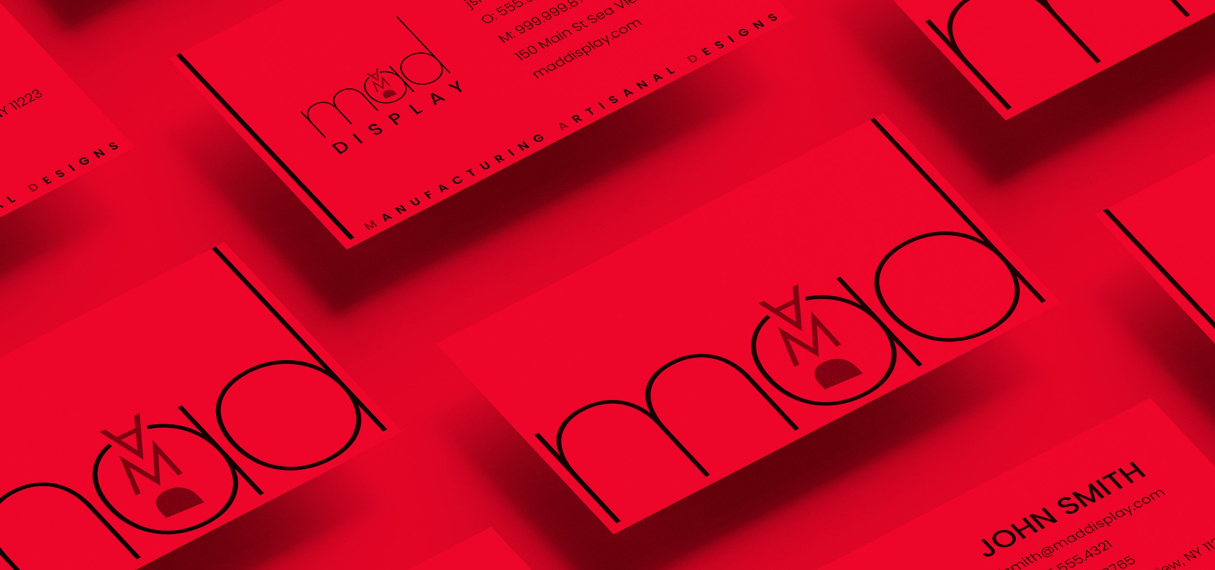
MAD DISPLAY BRANDING
While working for this display company the owners decided to revamp their brand. As the in-house designer I was super excited to jump into it as this was different than my day to day experiences. I then gathered the information from the owners such as the color scheme and general aesthetic. From there, I began to play with the letters from the word “MAD” manipulating it to look like an angry face. The versions with the Poppins typeface drew us in the most. This is when the logo you see today started to come alive. I then created the business ancillaries, store-front vinyl design, seasonal holiday card, email marketing tools and a dynamic portfolio site.


