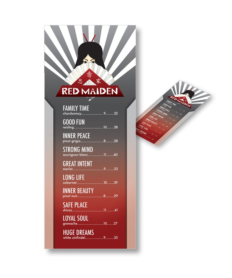
RED MAIDEN BRANDING
Loyalty, Family, and a long fulfilling life represent Red Maiden Winery. The Name is inspired by the legend of the Red Maiden who shared the same three beliefs within protecting her village. The Red Maiden would go incognito disguised as a geisha assassinating potential predators of their village. She concealed her identity with a large folding fan. The logo is an illustration of the Red Maiden and her hand fan on top of a base exhibiting the three Japanese symbols. Overall it sits in a triangular composition relating to hierarchy, a key element in Japanese culture. The color scheme is comprised mostly of black, grays, white, and two shades of red. Red symbolizing many things in Japanese culture including happy occasions and love. The typeface was hand created mimicking the aesthetic of Japanese brush strokes.
MY ROLE
Creator, producer, and conceptual artist of mock wine brand
Hand created logo and type
Making design decisions based on research
The winery’s ancillaries and menu designed
Wine bottle label designs


